
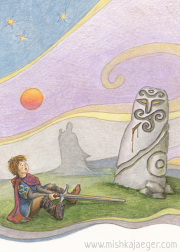
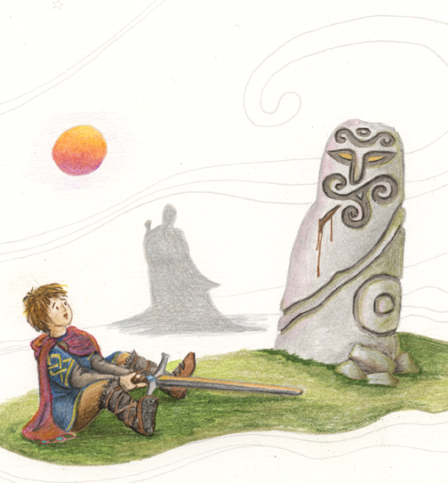
This piece was finished for Illustration Friday and Illustration Age’s challenge word, “Prize”. It is the boy, Arthur, and the Sword in the Stone. That’s a prize, right? — Excalibur and the throne of England!
I really wanted this completely done for IF but life happened and it was after midnight, EST on Thursday so I posted it to IF as a work in progress. If I was on a paid deadline, I’d have been up a few hours later to finish it, but as the Jaegerlings wake up around 6am, I thought it was best to get some sleep. Comparing the two scans, though, I almost like the work in progress better:
This is the second piece I’ve completed using good paper and colored pencils – still mostly the Mitsubishi’s (which nobody seems to have ever heard of) and a few Prismas. I’ve decided I’m just going to buy a full Prisma set when I have some extra money. They seem to be the easiest brand to replace individual pencils when you need to. But I’d still like to play with other brands, and I’ll probably still mix and match since some brands have better colors, I think though Prisma has a fairly staggering range. I was able to get to the one art supply store in the region last week and picked up a handfull of Farber’s. They’re a completely different critter. I also wonder about changing the tooth of the paper versus practicing a better technique. There’s a happy medium somewhere. Ackk that pun was not intentional.
I discovered through making a bunch of technical mistakes on this piece that blending Farbers is very different from blending Prismas. I bought a blending marker and some blending sticks. I also went way too heavy on the grass at first, and that was somewhat irreparable without digital help (I left it) but I like how the stone worked out. I think the Prisma brand blending sticks work best with the Prisma pencils (obviously) and that the blending marker may cause more harm than good though it makes a reasonable eraser with help from a blending paper. I think I should probably work on a the layering technique of building from soft to hard. This is art-school stuff I didn’t learn 20 years ago (because I didn’t go to art school) but it’s not too late to learn.
A little about the illustration now… I wanted to draw a different idea of the Sword in the Stone legend. The traditional image is of a sword plunged vertically and somewhat crucifix-like into the stone (or, kind of modern-looking anvil – thanks, Disney!). I wanted to tie back into the paleolithic roots of Britain and the (completely unfounded by any factual evidence) legend that there was a temple of standing stones on the top of Glastonbury Tor. I kept a little of the Christian reference by having Arthur pull the sword out of the side of the stone, also implying the idea of Arthur as a sort of Christ-like savior of Britain (the “Once and Future King”).
I also researched late Roman costume in the northern regions and hope I’ve achieved a reasonable account of what the boy Arthur would have worn. The figure approaching in the background is obviously Merlyn.
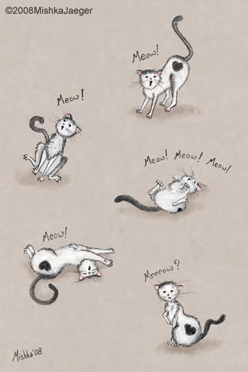 What part of “Meow” didn’t you get?
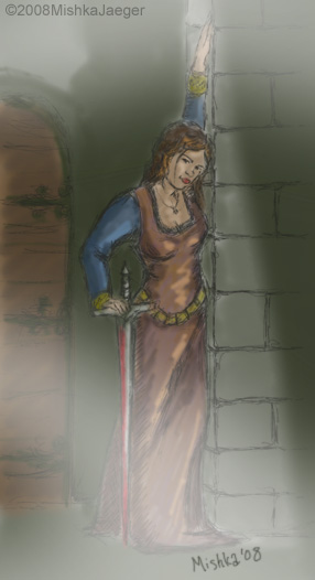 This past weekend we saw the show currently known as “Teller’s Macbeth” (though it’s actually co-directed by Aaron Posner). It was the best staging of Macbeth I’ve seen to date and it’s currently sold out through the end of the run. I was inspired by the production to draw this heavy – Lady Macbeth. To be clear, she was NOT portrayed in the play the way I have sketched her here. I decided I wanted her to be very young (too young to gauge the consequences of her action appropriately), ambitious, and super sexy (so that an older Macbeth would be captivated into pleasing her). So yeah I think my lady M is a bit of a rock star.
I did this sketch all digitally and very quickly (so it’s still very unfinished and still just a sketch). I tried another loose technique which started with my tracing a photograph of myself.
This past weekend we saw the show currently known as “Teller’s Macbeth” (though it’s actually co-directed by Aaron Posner). It was the best staging of Macbeth I’ve seen to date and it’s currently sold out through the end of the run. I was inspired by the production to draw this heavy – Lady Macbeth. To be clear, she was NOT portrayed in the play the way I have sketched her here. I decided I wanted her to be very young (too young to gauge the consequences of her action appropriately), ambitious, and super sexy (so that an older Macbeth would be captivated into pleasing her). So yeah I think my lady M is a bit of a rock star.
I did this sketch all digitally and very quickly (so it’s still very unfinished and still just a sketch). I tried another loose technique which started with my tracing a photograph of myself.
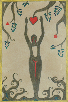
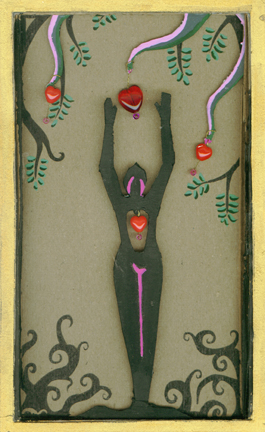
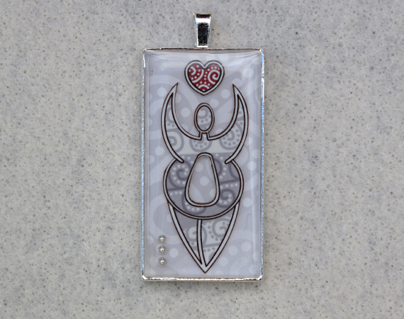
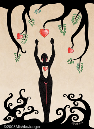 I painted this image about 14 years ago in my purple and silhouetted people phase. The original was done in watercolor and acrylic on a brown paper shopping bag. Two years ago, I recreated it digitally in order to make a template so I could build a three-dimensional Valentine’s card from it for a small competition (it won). This time, I decided to go back to the rough digital and clean it up to make it available for sale on