
Do you know what the enemy of “good” is?
It’s “better.”
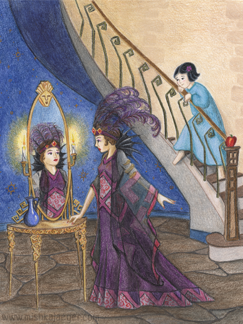
A little about the piece:
This piece is “Snow White and the Queen.” I’m continuing on my theme of fairy tales set in the early-ish 1900’s with a more theatrical Art Deco, old Hollywood setting.
I wanted to keep a little of the light = good/dark = evil symbolism as well as the hints of Snow White with a cobalt blue “Depression-Era” pitcher containing… something unknown and possibly vile, and of course the apple on the newel post.
I am not sure where the idea of the talking face in the mirror came from in the traditional Snow White depictions – possibly Disney? But my molded face atop the glass worked perfectly with the Art Deco design.
This mirrored dressing table is based on the silhouette of a piece I found on Google images but I changed the design to gold hard-edged roses. I also used this design on the Queen’s dress and the banisters.
Other Notes:
Today is the deadline for SCBWI’s November Draw This! showcase. As I’m still easing into colored pencil techniques, I decided to try mixing it up a little bit and combined regular pencils with some blue Derwent ink pencil and regular Derwent watercolor pencil (which I also just discovered I own – it would seem I’m an art supply hoarder). I also got a water brush. What a concept! I’m still undecided on the paper. I used Strathmore Bristol 400 which seems to have a bit more tooth than I’d like.
Because I was trying some new things, I dragged my feet a little. I didn’t want to screw up what I’d already done by failing at new techniques. Also, I still haven’t really pushed my contrast as much as I could. I realize I’m being timid about it and I see a couple of things I could have done better to add a bit more drama.
Tonight, after we got the kids to bed, I figured I’d put the finishing touches on the piece before submitting it and decided the wall behind Snow looked a little bare. So I drew in some stones. Being tired from Jaegerling2 being up part of the night (he’s 2… maybe he’s teething those last molars?) I drew the stones rather ham-handed and a bit too dark.
Oh fudge. That’s it. Time’s up. Pencils down.
Luckily, it was a fairly straightforward clean-up in Photoshop. But I’m annoyed about it because I deliberately used gold opaque watercolor on the “wallpaper” pattern because I wanted the original to look really cool and shiny. I knew full well the gold would scan in umber tones (I’ve at least done THAT before). So the original looks really bright and colorful — the digital reproductions never really capture the depth of the color we achieve on paper — except for those dang stones.
Oh well. Call it “done” and move on.
All in all, I do like how it turned out. Though it probably could use a cat. There was a cat in my original sketch but he seems to have wandered off.
10/23/2015 @ 11:01 pm
Lovely! I think I see the influence of The Twelve Clocks!