
Red Riding Hood
This year I swore I wasn’t going to enter the Tomi Depaola competition again. It was too much aggravation and hassle the last couple of times. I’d put it off until the last minute because it wasn’t a priority – until, of course, it suddenly was. Like many of my peers, I also got the distinct impression that “Tomie just doesn’t like my work” (don’t ask why we all feel that way – chalk it up to artist’s insecurities). Lastly, Mr. Depaola has been frustratingly less than punctual on his end of the deadlines as the quality of the work always makes it hard to pick a winner. It’s his competition. *shrug* So I wasn’t going to do it.
And then I read the prompt:
One of the biggest and most important challenges the Children’s Book Illustrator faces, over and over again, is the UNIQUE VISUALIZATION of the MAIN CHARACTER.
So often, I have seen illustrators resort to generic depictions of the star of the story too “designed,” too ordinary, too much like characters already seen in media, especially on TV and video games.
The assignment is simply to illustrate a moment from the following passage from Philip Pullman’s version of “Little Red Riding Hood” from FAIRY TALES FROM THE BROTHERS GRIMM (Viking, 2012). (You may want to read the entire story. It is an excellent book.)
And immediately sketched a rough draft inspired by:
Once upon a time there was a little girl who was so sweet and kind that everyone loved her. Her grandmother, who loved her more than anyone, gave her a little cap made of red velvet, which suited her so well that she wanted to wear it all the time. Because of that everyone took to calling her Little Red Riding Hood.
One day her mother said to her: “Little Red Riding Hood, I’ve got a job for you. Your grandmother isn’t very well, and I want you to take her this cake and a bottle of wine. They’ll make her feel a lot better.
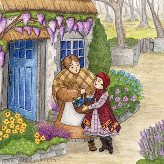
My rough draft inspired my last couple of fairy tale illustrations set in the 1920’s/’30’s. This time I tried not to leave it until the last minute, but life interfered and my idea of what I wanted to draw wasn’t jibing with how the characters wanted to be drawn. After a bit of arguing, I gave in (the characters usually know best anyways).
My setting is 1920’s northern England, though the cottage is much older. I wanted Red to look a little more modern as she wants to someday become a “woman of the world,” while her mother is comfortable wearing the older, rustic fashion. Red’s world is comfortable, happy, and cozy. The world beyond the gate begins the misty, ominous forest.
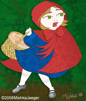
Mr. Depaola has an excellent point… we all think of Red Riding Hood looking the same way in an 18th century travelling cape, no matter what time or place she’s set. The last time I drew Red back in 2008, this is what she looked like, captioned, “This is my rather standard treatment of Red Riding Hood.”
So far, a number of my colleagues have shared their entries to the competition in the PB critique group on Facebook. All I can say is that once again, Mr. Depaola is going to have a seriously hard time picking a winner. I’m personally blown away by my competition. Winning would be nice, but I really entered because the topic was inspiring. And I think I produced a pretty darn good illustration.
12/1/2015 @ 10:06 pm
Mishka, your entry is absolutely beautiful! It’s funny that you mention our “artist insecurity,” because I think we all feel that. 🙂 However, you have created a lovely new work to share, and so you are already a winner in my book!