Mishka Jaeger
Words and Pictures
RSS
  • Home
  • Blog
  • Portfolio
  • Projects
    • The Omer Project
  • Store
  • About

Heal the World – Seeds of Peace

9/14/2014 By Mishka in General, Work

peace_hamsa_color2_lo

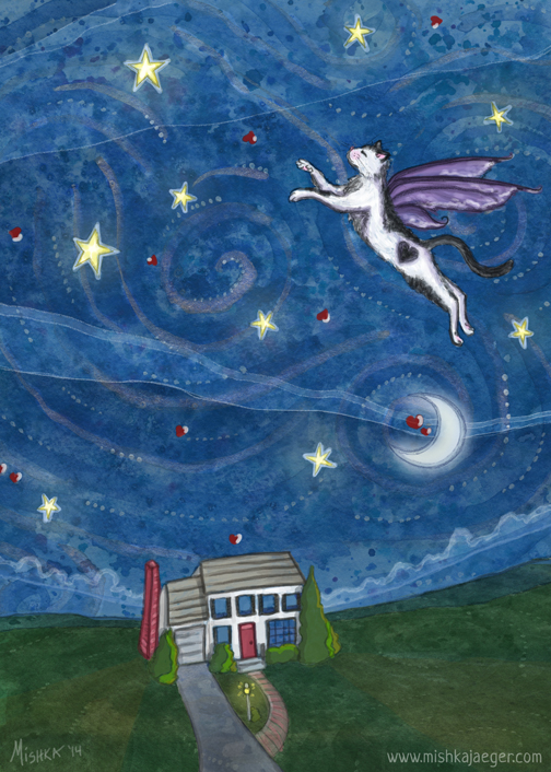
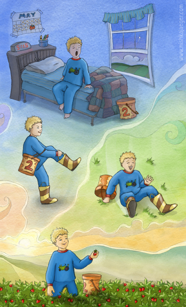
What does an artist do when she feels strongly about something she feels helpless to do anything about? She makes art.

This past summer, I discovered that Facebook’s algorithms made it hard for me to share articles or comments that truly represented how I was feeling about the Gaza war. It seemed only the same 12 people were seeing the shares in my feed. My sympathy went to those on both sides of this conflict. Ultimately, I deleted my shared links and comments. I didn’t think I was being heard. And this weekend, I finally finished this piece. I hope a picture really IS worth a thousand words.

Among several groups I have been following on Facebook are Palestine Loves Israel, moderated by the wonderful Palestinian woman who goes by JouJou (I also heard her interviewed this summer), and Israel Loves Palestine, moderated by Noa.

Israeli graphic designer Ronny Edry started sharing the love with the original group, Israel Loves Iran (please watch his TED talk), which has now grown in sharing the love to become The Peace Factory. These groups are based on the notion that when people get to know and understand each other, and are no longer nameless, faceless statistics, they can find care, common ground, and peace.

Here’s the story, quoted from the Peace Factory’s website:

PEACE it’s VIRAL
PEACE starts with the people, one person at a time.
Today it’s easier than ever to connect and reach out to one another. We can talk, we can meet, and we can start a new friendship without even leaving our homes just by the click of a button. One new person, One new connection. Peace is when we see and treat each other as people. All we have to do is talk.
Another group of note that made the news this summer is Jews and Arabs Refuse to be Enemies which actually began on Twitter.

I would also like to call out some other grass roots organizations dedicated to peace via friendship that could use some support (and if I can figure out a way to make some print-on-demand items available using this image, I will be donating any proceeds to these organizations. Suggestions are welcome here!):

  • Seeds of Peace inspires and equips new generations of leaders from regions of conflict with the relationships, understanding, and skills needed to advance lasting peace.
  • Hands of Peace is an interfaith organization developing peacebuilding and leadership skills in Israeli, Palestinian and American teens through the power of dialogue and personal relationships.
  • Children of Peace seeks to protect all of the children and their communities in Israel and Palestine – regardless of culture, faith, gender or heritage.
Some notes about my art: Hamsa means five. This stylized hand symbol can be seen throughout the middle east. It is and it is not a religious symbol, predating the Abrahamic religions whose cultures all use the symbol as a folk amulet of protection, happiness, prosperity and peace. Peace. Which makes it a fantastic shared symbol to represent peace for all. It is also known as the Hand of Fatima, Miriam, or Mary, or The Hand of All Goddesses (depending on religious pursuasion) which, to me, makes this a very powerful feminine symbol. And if you follow my work, you know I love symbols of the divine feminine. Read more on wikipedia.

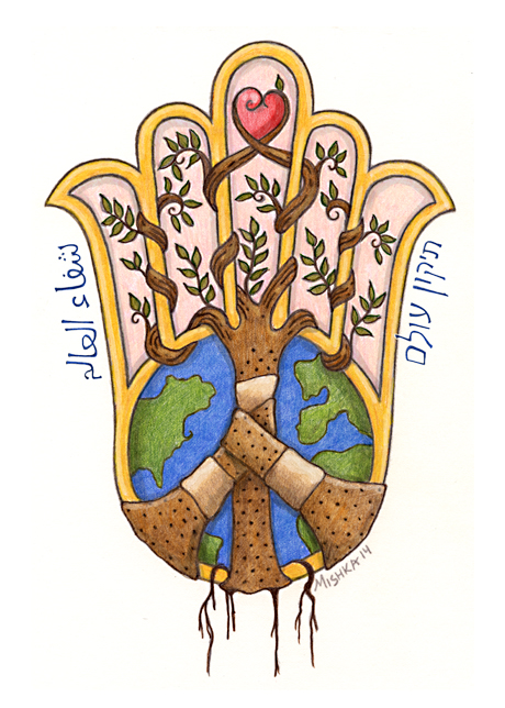
And just to be ham-handed (er, pardon the non-kosher/non-halal pun), I also included the western peace symbol of the 1960’s made up of band-aids from which an olive tree is growing. The original sketch is in pencil and colored pencils with a little clean-up help from Adobe Photoshop.

The text on either side in Arabic and Hebrew reads, “Heal the World,” which is a major tenant in (predominantly western) reform Judaism. After this summer, it’s pretty obvious that the world is in serious need of some healing. It is my sincere hope that someday when the children of Israel and Palestine come together in peace, the rest of the world may follow. Special thanks to my beautiful and artistic friend, Dania, for helping me with the Arabic which I can neither read nor write.

Farewell to Charlemagne

9/1/2014 By Mishka in Children's, General, Work Tags: cat

flying_cat_5x7_lo
A little “Starry Night” and a little Chagall, a tribute to Char-Cat, who flew away.

On August 21st we said goodbye to our cat of 10 years, Charlemagne. He was a great cat. He loved people. As I’ve said previously, he did indeed have a black heart on his side. It became two hearts when he sat down. He rolled in dirt like a dog, shook hands for treats, and bossed me around because I was the female. But he had the world’s loudest purr and was just the friendliest and most playful furball. He thought he was a person, I think. We are all sad that he got sick and left us a little too early.

Today, I finished this illustration. I like the image of him flying off, over the moon and back to g-d. I always imagine people and critters flying away when they die. It’s a calming and comforting image to me.

I’ll probably keep drawing white cats with black hearts on their sides, even though I deliberately never drew his spotting correctly. Here’s one of the last photos of Char. Maybe we’ll meet again someday, little cat.

char_cropped

And Now For Something Completely Different

8/25/2014 By Mishka in General, Work

IMG_6604

A photo of not quite dry watercolor and guache. The color here is all messed up because it’s just an off-the-cuff photo but I suddenly had the urge to post it. Why? Because it is SUPPOSED to be the background for an illustration I’m working on. It’s the sky. And it kind of doesn’t look like a background. So we’ll see if I use it or not.

Now I just want to start doing a whole bunch of these texture watercolor/guache things. I wonder if they can stand on their own as complete works of art (even though I want them for backgrounds). Perhaps I will make some for the annual “Art from the Heart” this December and see.

Fluevog Creative: Half-Truth Bronte

8/5/2014 By Mishka in General, Other Challenges, Work

halftruth_bronte_lo

Sometimes I run out of time and it has to just be “good enough.” But I’ve been thinking about this one for a while and I thought the pun on the famous Fluevog slogan was too good to pass up. It would have been a shame not to do something for it. Besides, I really like these shoes! Even though I didn’t quite get the color right in my illustration. I think I finished this end-to-end in under 8 hours. I need to work on my “quick draw!”

For those familiar with Wuthering Heights, this one’s obvious. Here are some quotes from the book on which I based this. First, the setting. Second, the action:

The whole furniture consisted of a chair, a clothes-press, and a large oak case, with squares cut out near the top resembling coach windows. Having approached this structure, I looked inside, and perceived it to be a singular sort of old-fashioned couch, very conveniently designed to obviate the necessity for every member of the family having a room to himself. In fact, it formed a little closet, and the ledge of a window, which it enclosed, served as a table. I slid back the paneled sides, got in with my light, pulled them together again, and felt secure against the vigilance of Heathcliff, and every one else.

I must stop it, nevertheless! I muttered, knocking my knuckles through the glass, and stretching an arm out to seize the importunate branch; instead of which, my fingers closed on the fingers of a little, ice-cold hand! The intense horror of nightmare came over me: I tried to draw back my arm, but the hand clung to it, and a most melancholy voice sobbed, “Let me in! let me in!” “Who are you?” I asked, struggling, meanwhile, to disengage myself. “Catherine Linton,” it replied, shiveringly (why did I think of Linton? I had read Earnshaw twenty times for Linton) “I’m come home: I’d lost my way on the moor!”
Emily Bronte, Wuthering Heights, 1847
Of course I changed this to “I’ve lost my shoes on the moor.” Hopefully I’ll get into the finals this time around.

Entering the Tomie Depaola Award 2014

6/15/2014 By Mishka in General, Other Challenges, SCBWI, Work

The Best Day For Strawberries

Here we go again. My submission for the SCBWI Tomie DePaola Award. It’s a two-parter this year. 10 people will be picked at the end of July to go on to round 2. This was the challenge (I hope that labeling the month on the calendar doesn’t count as words):

The task is to create a six-panel sequence that has a beginning, middle and an end that is obvious, featuring a character of your own invention. It can be funny, sad, dramatic or ordinary, but interesting and with lots of invention and finesse.
I understand that there are computer programs that make sequence easier than good old-fashioned drawing. But, I don’t know any of them. I leave it to you.
SPECS:4 to 6 panels illustrator’s choice

SIZE:8½ x 14 horizontal or vertical *Please note this is the size of the entire piece, not the individual panels.
COLOR:B & W or Full Color your choice
NO WORDS
Anyway, I guess I had strawberries on the brain last month. Jaegerling1 and I went picking up at Butler’s Orchard (I’ll need to illustrate the outfit she chose to wear at a later date. It was perfect!) and my submission for the BWI competition included strawberries. I tried really hard to come up with something  bigger and bolder with more eye-catching characters, and even tried to come up with a different story. But this is what happened. In fact, it insisted. Maybe it’s a reflection of the calm I am trying to attain in my life rather than a reflection of the chaos. Also, if you’ve never had a freshly-picked strawberry, you have never had a strawberry.

This was also, conveniently, one of my story ideas for PiBoIdMo 2012, which I called “The Most Perfect Day For Strawberries.” The idea (and, apologetically, the working title as well) was inspired by an editorial in Real Simple Magazine by James Ireland Baker that has absolutely nothing to do with children’s stories but is an excellent (though melancholy) read. This simple section hidden in the essay told me a different story than was intended,

Or the joy of trolling Hoboken, New Jersey, markets looking for strawberries on what Philip called the Perfect Day for Strawberries. There’s one day in June when all the strawberries are perfect in New Jersey, he said. The key is just to find it.
Here, in Virginia, that day is really toward the end of May. And Philip was talking about finding the berries at a farmer’s market, not going to pick them. And let’s just say I have it completely out of context now.

I have learned that the best time of day to pick the berries is as early in the morning as possible to keep the berries firm and all the juice inside. Picking in the heat of the afternoon sun leads to slightly cooked, though still quite tasty berries. My boy (who, yes, is a depiction of Jaegerling2 at an older age), is looking for perfection. I haven’t fleshed out an entire story (yet) though it’s possible that all I’ll have is just this illustration. If there can be a “short story” in picture book literature, maybe this is it (at least until I find out if I advance and what the next task will be)! Hopefully, this speaks for itself as that is indeed the challenge!

Some notes on my process: I did all the panel sketches separately in my sketchbook, then scanned, seamed together and cleaned them up with Photoshop. I then printed out a draft and light-tabled it to do corrections. In fact, I changed the poses of both middle panels entirely. Here were my originals (after I altered panel #3, Bill pointed out that it was now too similar to panel #2 so I redrew that as well).

depaola_2014_strawberries_sketch1

Newish to my process is the addition of a watercolor wash for the background, suggested by my friend, fellow illustrator, and virtual studio-mate (because it seems we’re always on-line at the same time), Tami Traylor. I printed out the new version and then did the wash using the light table again, and on watercolor paper. Actually I did two washes and superimposed them with Photoshop, then used the “multiply” brush to bring out and recolor the sections. I used regular Photoshop brushes to paint gouache-style, on top of the wash. I like the way it came out but ran out of time to do proper color-checking on the blues (life happened. As it does.). I realized that a bit late, so for now it will have to do.

And now, it’s almost July and the season has changed. We’re on to high summer blueberries and cherries, early peaches and watermelon. Welcome, summer!

A Goddess For BWI

5/31/2014 By Mishka in General, Other Challenges, Women, Work

babywearing_color_pencil_lo

That’s Babywearing International, not Baltimore Washington International…

If you’re a member of thebabywearer.com, please go to this thread to vote (“like” my post) if you love my submission.

I submitted this to an image contest to try and win some lending library items for our local babywearing chapter (this link will probably only work if you’re a member of the BWI website). They’ve been quite helpful and an all around bunch of great folks. I started wearing JaegerThing1 when she was about 4 months old and have somehow managed to stave off a woven wrap addiction (I currently only have two). I do have to stifle myself a little when I see other moms and dads babywearing. I can get a little over-exuberant about it. I like to help out folks who are new to wearing and don’t know a lot of their options. I always point people towards the local Babywearing International chapter.

Anyway, about this illustration… I had a bunch of ideas and not a lot of time so this is the one that came out. Maybe another time, I’ll do some of the other illo ideas I had. They were a bit more representational and less presentational (which is often a criticism I get of my illustration work).

This was a tough one, really, because the theme is so open-ended. And because babywearing is so much about everyone, I didn’t want to do an exclusive illo. However that is indeed what I’ve done. Another goddess. I am just drawn to drawing goddesses I guess, so apologies to the men right off the bat.

My sketchbooks of the last 20 years show me that I have always seen women as goddesses. I look to other women for guidance, inspiration, and often spirituality. When I became a mother, one of my goddess friends introduced me to our local babywearing group. I had inherited a mei tai and had been gifted a Moby, two Ergos and a Pikkolo and I needed help figuring out what to do with all these things.

Now, as a mother of two, I find that wearing my children is essential if I want to get anything done. All of the moms in our playgroup have now had their second children and even the ones who didn’t wear their first are now starting to wear their second. I am happy to be able to guide them.

I am blessed to be among these groups of mothers helping and supporting mothers. Even on our worst days when we haven’t slept at all and are covered in food or milk and whatever else our kids have wiped on us, trying to muddle through dinner time and feedings to bedtime, and we feel like complete crap, we have this wonderful network to insist to us that we are wonderful radiant goddesses and that we created these little lives and continue to nurture them, our partners, and if we can manage a little time to ourselves, ours as well. My image is one of those times, when you can just savor being in the moment. And the strawberries. They’re in season here now, too.

Also, at the suggestion of my husband, I tried color pencil for the first time in aeons… so long, in fact, that the only pencils I own are watercolor ones. I did not use water on this though I may go back and see what happens. I did screw up the color on the border oval pretty badly. I had to clean it up in Photoshop. I never can get 100% away from the computer anymore.

1 2 3 4

Follow me:

  • Instagram
  • Bluesky
  • Facebook

Search this blog:

Categories

Archives

Mishka Jaeger
© Mishka Jaeger 2026
Powered by WordPress • Themify WordPress Themes

↑ Back to top