
Sometimes when you’re tired, you do and say dumb things and then you *facepalm* and groan and hope you didn’t screw up too badly. I really need to get the littlest Jaegerling’s sleep schedule and my own to be better aligned (he’s two. what can I say?).
Anyway, Penguin childrens’ book art director and mentor Giuseppe Castellano hosted a #twitterclass where he gave some really great twitter critiques of every illustration submission he received between 9 and 10pm. I was tired and had found out about the “class” 5 minutes before it began so I was more focused on quickly finding something recent and remotely critique-worthy to post than editing my tweet to say exactly what I meant. I wrote “Still working towards style.” By “style” I really meant a flow, an ease of technique and process. I didn’t mean my own personal voice. It was a poor choice of word. *Facepalm.* Mr. Castellano referred me to his blog post on style (which I had already read) that’s pretty much about why he dislikes the word.
After I got over feeling stupid, I read the rest of the critique tweet. Mr. Castellano also mentioned that my drawing looked too outlined and that the colored pencil wasn’t working well with the paper. True and true. I have been using cheaper materials, working on the theory that if I could make something nice with cheaper materials, I should be able to make something even better with GOOD materials. I also wanted to make sure I even wanted to continue with pencils and explore the feel of other brands before I invested a hundred or so dollars in a standard Prismacolor set.
I do have other materials in my cabinets, though. So I dug out some Bristol and unearthed a set of Mitsubishi colored pencils that someone (probably my artist aunt) had given me years ago, grabbed a sketchbook, and set to work on a piece for the SCBWI “Draw This” monthly challenge for October.
I only left myself 2 days to produce something so I challenged myself Project Runway style. Make something work. The challenge word is “Enchanted.” Go.
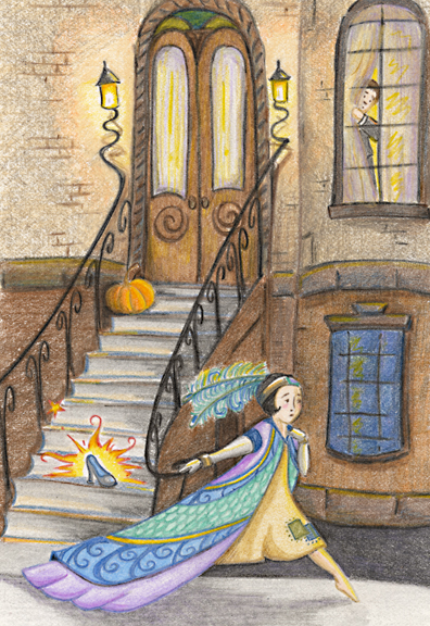
Because I’ve been focusing on my process (and not because this is a masterpiece by any stretch), I’m going to step through what I did to create this piece. I welcome any professional advice on the media and my process because I’m still learning by doing (and probably always will be). This piece reflects some of the skills I’ve been working on in my #100DaysOfSimple project. I’m working faster, a little looser, and with a little more line efficiency than I had been previously.
I don’t remember why but I had been looking at some Erte prints recently so I felt a little deco-inspired. Not sure why I picked Cinderella but that’s what came to mind. I deemed my third sketch satisfactory. The rest of my procedural notes are in the captions of the slideshow below.


9/21/2015 @ 3:51 pm
what you did NOT say (or brag about which I will) is how you consciously or unconsciously mastered the movement of Cindarella. Everyone can improve lines or “fix” stuff in photoshop. A true artist grasps the essence of the moment which I, for one, am really proud of!